Automating Network Inventory Reporting: SQL, Data Visualization and Email

Scenario: I was asked to send an inventory reports every month that demands lots of tweaking/calculations, handle multiple files to get the desired result. At first, I was doing everything on excel, it took me hours and hours and I needed to do it every end of the month. It was daunting 😥.
After working through
excel formula → get data → get chart → send report. It was a great time to try automate the task. Here is the gist of it.
Setup ⚙
As shown in a picture above, lets assume we have SQL database to query data from. We will now lay our pipelines to gather and manipulate data.
SQL Query
This is example of SQL query where the data can be fetched. I usually start from select * from Table and check the columns that I am interested in. In my case, I have to find the serial number of all cisco devices and get the manufacture dates out of it.
select  n.SysName as Nodename,
n.MachineType,n.D_Owner as Owner,
i.ServiceTag as SN
from Nodes n
inner join InventoryTable i
on n.NodeID=i.NodeID
where n.Vendor LIKE '%Cisco%'
AND i.ServiceTag IS NOT NULL
AND LEN(i.ServiceTag) > 0
AND n.D_Owner LIKE '%network%'
Data CleanUp
This is actually depends on us how we want to clean up some mess in the data. We can use SQL to replace or use shell or use python. In bash shell, sed and awk can be used to clean up any kind of text manipulation. As as example, I can remove unwanted domain name on the trailing router name by any of these methods:
~$ echo "Router name is router.xyz.org"
Router name is router.xyz.org
~$ echo "Router name is router.xyz.org" | sed 's/.xyz.org//g'
Router name is router
Or in Python,
>>> df['MachineType'] = df.MachineType.str.replace(".xyz.org","", case = False)
In my case, I have generated the manufacture year of all cisco devices (switches/routers), based on Serial Number. You can find more info on how to determining-manufacture-year-from-system-serial-number.
# Dictionary to convert SN to Manufacture Year
code_to_year = { "01":"1997","02":"1998","03":"1999","04":"2000","05":"2001","06":"2002","07":"2003","08":"2004","09":"2005","10":"2006","11":"2007","12":"2008","13":"2009","14":"2010","15":"2011","16":"2012","17":"2013","18":"2014","19":"2015","20":"2016","21":"2017","22":"2018","23":"2019","24":"2020","25":"2021","26":"2022","27":"2023","28":"2024","29":"2025","30":"2026","31":"2027","32":"2028","33":"2029","34":"2030","35":"2031", "":""}

# Output CSV based on manufacture year and manufacture month
for line in csv_reader:
    switch_name_with_stacknumber = line['Nodename']+"-"+line['SwitchNumber']
    csv_writer.writerow({'Nodename':switch_name_with_stacknumber,'MachineType':line['MachineType'],'Owner':line['Owner'],'SN':line['SN'],'Manufacture Year':code_to_year[line['SN][3:5]],'Manufacture Month':code_to_month[line['SN'][5:7]]})
Output CSV file:

Diagrams
✅ Pie Chart
There are many ways to draw beautiful graphs using python. Usually, pie charts, bar charts and 2D plots can be used in all scenarios.
import matplotlib.pyplot as plt

# ADD REGIONS HERE
regions = ['Buffalo','Albany','Syracuse','New York City','Brooklyn']

# ADD COUNTS HERE
counts = [1227,1099,969,258,178]
#cols = ['c','m','r']
cols = ['lightgreen', 'gold', 'lightcoral','pink','lightblue']

f = plt.figure()
plt.pie(counts,
    labels=regions,
    colors=cols,
    startangle=90,
    shadow=True,
    explode=(0.2,0,0,0,0),
    autopct='%1.1f%%',
    radius=4)
plt.title('Device Count VS Region')
plt.axis('equal')
plt.show()
f.savefig("all_region.png", bbox_inches='tight', dpi=150)
Result:

✅ Bar Chart
import random
import pandas as pd
import matplotlib.pyplot as plt
# Import Data
df_raw = pd.read_csv("your_report.csv")
counts = df_raw['Count']
model = df_raw['Model Name']
# Coloring
all_colors = list(plt.cm.colors.cnames.keys())
random.seed(100)
c = random.choices(all_colors, k=8)
# Plot Bars
f=plt.figure(figsize=(10,6), dpi= 80)
plt.bar(model, counts, color=c, width=.4)
plt.title("Network Gears Bar Chart", fontsize=15)
for i, val in enumerate(df_raw['Count'].values):
        plt.text(i, val+27, val , horizontalalignment='center', verticalalignment='bottom', \
        fontdict={'fontweight':400, 'size':9}, bbox=dict(facecolor='gold', alpha=0.09))
plt.gca().set_xticklabels(model, rotation=60, horizontalalignment= 'right')

plt.ylabel('Counts', fontsize=15)
plt.ylim(0, 1010)
plt.show()
f.savefig("NG_Bar_Chart.png", bbox_inches='tight', dpi=600)
Result:

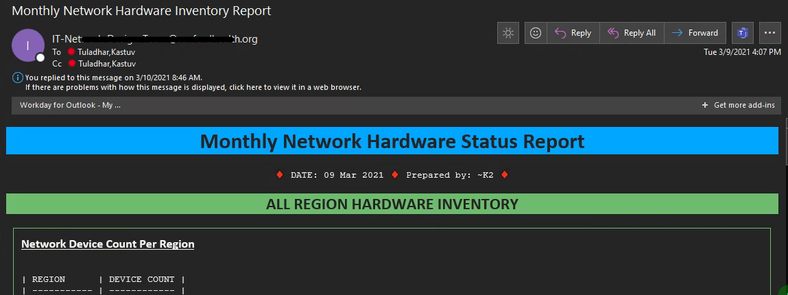
Email (HTML Format) and Scheduler
Emails can be send as HTML format and our data can be placed inside the tags field as a name of variables. This is just an idea and snippets but result can be lot fancier. After we get our desired template of the email setup, we can schedule to run the script on the desired interval.
#!/bin/bash

(
echo "From: no-reply@xyz.com"
echo "To: user1@xyz.com;user2@xyz.com"
echo "Cc: user3@xyz.com;"
echo "Subject: Inventory Report"
echo "Content-Type: text/html"
echo
echo "<html>
<head>
<style>
div {
  width: 50%;
  border: 1.5px solid green;
  padding: 10px;
  margin: 10px;
}
</style>
</head>

<body>

<h1 style=text-align>Monthly Network Hardware Status Report</h1>
<pre><p style=text-align:center;>DATE: $(date +%d" "%b" "%Y)</p></pre>

<h2 style=text-align:center>ALL REGION HARDWARE INVENTORY</h2>

<div>
<h3 style=line-height:1em><u>Network Device Count Per Region</u></h3>
<pre>
$(cat report.txt)
</pre>
</div>

</body></html>"
echo
) | sendmail -t
Result:

Summary
There are many ways to automate your reporting task. If data manipulation is required, excel may not be sufficient to complete the job on time or may be hectic to perform over and over again. In such condition, I would strongly suggest to use through some programming tools. Learning curve could be steep but reward and use case are pretty high.